Showing posts with label Less Is More. Show all posts

Saturday, June 9, 2018

Rainbow Wishes


Addicted To CAS Challenge #138 is up and running with code word: RAINBOW.

To create my card, I die cut a piece of water color paper with Paper Smooches Linked Hearts Die and colored it with Zigs. I adhered it to a white card base, and added a sentiment from Paper Smooches Luminous Spring stamp set stamped with VersaFine Onyx Black ink.

Don't forget, as always, Happy Little Stampers is our Sponsor, and Kylie is generously awarding the winner with a $20.00 gift certificate to the store!

Wonderful and talented Carol Gunn of Carol G Creates is Guest Designer for this challenge.  Carol's creativity is so inspiring. If you haven't met her yet, please take a stroll through her blog. You will be so glad you did.

Please head over to the ATCAS Challenge Blog and see what Carol and the Design Team have created to inspire you. Join us in the gallery for a chance to win!

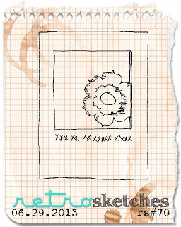
I am also playing at:


Paper Smooches Luminous Spring was released in 2015

Sunday, October 8, 2017

Enjoy The Season Of Color


The October Happy Little Stampers October Anything Goes With Dies Challenge is up and Running. As always, the theme is Anything Goes as long as you use dies on your project. Winner for this challenge will receive a $20 coupon to spend at the Happy Little Stampers Shop! Check out all the details HERE.

The leaves are die cut and stamped with PTI's Leaf Prints stamps and dies and fastened with a piece of linen twine. I distressed the edges of a panel of SU Confetti Cream paper, adhered the bunch of leaves to it, and stamped the sentiment from Paper Smooches Fall Sampler using VersaFine Vintage Sepia Ink. The word "autumn" from Winnie & Walter's Big, Bold Seasons was die cut from a watercolored panel from another project. I placed it across the bunch of leaves and added some Clear Nuvo Drops to simulate autumn dew.

Please head over the the Happy Little Stampers October Anything Goes With Dies Challenge and check out the awesome projects created for your inspiration by the HLS AGWD Designers. Get out your die cutting device and play along to share your creativity and for a chance to win!

I'm also playing at:
The colors I used put me in mind of Cayenne and Turmeric and Mustard and Wasabi...


Tuesday, June 6, 2017

Neapolitan


What a great idea for a challenge theme! In the language of ice cream, Neapolitan usually refers to a trio of ice cream flavors which is often a combination of vanilla, chocolate and strawberry. I did a little research and the story is much more broad. For a little history on Neapolitan Ice Cream's sweet origins, click HERE.

I really had fun with this one! The color in my photograph is off a little. The color on the embossed hydrangea is true, but the butterfly is actually rose-colored, and the sentiment is stamped with Versafine Vintage Sepia ink and much more brown than it appears in the photo.

I'm also playing at:


Sunday, January 8, 2017

Hello


It's time for the first Challenge of 2017 over at The AAA Cards Challenge Blog where the theme is HELLO.

The challenge is sponsored by Happy Little Stampers. Kylie Purtell, owner of Happy Little Stampers makes an appearance on the AAA Blog as Guest Designer for Game #81!

Valentyna of flourishtina.com is Guest Designer for this challenge. Treat yourself to a stroll through her blog for some wonderful inspiration.

Here is my take:
While my new purchases continue to roll in, I have promised myself to continue to dig into my stash and break out things I have never used. This wonderful little image from PTI is one of them. I love this little telephone stamp and die set (HEART-2-HEART #4) that has been sitting, waiting patiently to come out of its packaging for years. I used 3 shades of orange-hued ink on the phone and gave it a little ombre look. I embossed the wonky circle in the card base and popped up the phone and sentiment banner with foam tape.

Please head on over to the AAA Cards Challenge Blog and see what my awesome teammates have created for your inspiration. What's your take on HELLO as we begin a new year? I can't wait to see what you come up with.

I am also playing along at:

Less Is More #310 - Colour challenge. Use an OMBRE technique with your chosen colour

Simon Says Stamp Monday Challenge - Start Afresh. Use something fresh out of the packaging, i.e. something never used before.


Monday, June 27, 2016

Miss You


I really love the simplicity of CTS #178  When I saw it, this little lobster die popped into my head and out of my stash. I cut him from a scrap from a Distress Ink project and set him on a little bit of stenciling that put me in mind of a fishing net. Lobsters remind me of my dear, lifelong friend who lives far from me in northern Vermont.  Last time we visited, we celebrated with a wonderful dinner on Long Beach Island of lobster and scallops. This is a perfect card for her.


This card was also inspired by the following challenges:

It's been far too long since I played the wonderful Less Is More challenge. This week's recipe is USE A STENCIL.


Thanks so much for  coming by today.

Supplies
Paper~Neenah Solar White.
Stamps~MFT Penguins In Paradise.
Ink~VersaFine Onyx Black, and Salty Ocean, Blueprint Sketch DI's.
Accessories~Memory Box Lobster Die, TH Burlap Layering Stencil.

Monday, August 24, 2015

Lucky To Know You!


Lots of fun stuff today. I bought a MISTI a while back and for some reason I was intimidated by it.  I finally cracked it open, watched a few videos, and now I wonder why I was so silly in not using it as soon as it got to my door. It is AWESOME! And I keep thinking of all of the zillions of cards I did over because of wonky stamping. I can't wait to explore its capabilities. This thing is awesome.  Get one!!

I had a beautiful scrap of watercolored panel which I die cut as above, but I stamped it by eyeballing and it was WONKY!!!! So, I made a new watercolor piece and did the same thing, but this time I used the MISTI, and voila! Perfect placement.  I added a little stitching with Paper Smooches Stitched die, some embossing with Tim Holtz's Speckles stencil, some gold thread and some sequins.

I am linking this card to the following challenges:


Create a Birthday Themed project.

Create a project using any kind of Technique you'd like.
or Mash it Up! and created a Birthday themed project and any Technique. 


I combined 4 techniques of Watercoloring, Heat Embossing, Die Cutting, and Stenciling.

Thanks so much for coming by today!

Supplies for this project:
Stamps: PTI Wonderful Words Additions.
Paper:  Gine K Pure Luxury White Card Stock, Tim Holtz Distress WaterColor Cardstock.
Ink: VersaFile Onyx Black, Tsukineko Delicata Golden Glitz.
Accessories: SU Clear EP, Heat Gun, Paper Smooches Stitched Dies, Tim Holtz Speckles Stencil, PTI Wonderful Words Dies, Kuretake Gansai Tanbi 36 Water Colors, DMC Metallic Thread, Shiny Gold Sequins, MISTI.

Saturday, July 6, 2013

Thoughts and Prayers


I made this card for this week's Less Is More challenge which is to use at least two shades of grey.  I used three shades of grey on this creation. The image is SU's Medallion. The sentiment is from Verve's Meditations collection.

Thank you for your visit and please know how much I appreciate your comment. Have a lovely day!

Tuesday, July 2, 2013

Thoughts of You


My blogger friend Joyce of Cards-by-the-Sea, who is such an avid crafter and is so supportive with her comments, made THIS fabulous card recently.  As soon as I saw it, I knew I had to CASE it.  So with her creation as inspiration along with this week's Retro Sketches challenge, 

and this week's Less Is More challenge
SAND

which for this week is to use the color, the texture, scenes of sandy places, sandpaper, actual sand... or wherever your imagination takes you,
I came up with this card.

I love these starfish and sand dollar images and dies from WPlus9. I have owned them for a while, but I have never inked them up. Joyce's card inspired me to pull them out and enjoy them.  The Retro Sketch was the perfect layout for my idea.  As for the Less Is More challenge, I have not played in such a long time. My crafting time has been slim over the last year in particular.  I am a beach lover, so coming up with something with SAND as my inspiration to play this week (finally) was fun.  The best part is that when my 13 year old son saw my card, he said "I love the way the background looks like a sandy beach". That is just what I was going for, so yay!

Thank you so much for coming by today.  I am off for the summer. That combined with the weather having been so stormy here in the North Eastern part of the US for several days, has resulted in my getting much longed for crafting time.  Be well.

Images-WPlus9 Guiding Light, PTI Crackled
Sentiment-MFT Essential Sentiments

Monday, April 30, 2012

I Appreciate You


This is my creation for this week's Less Is More challenge, which is a sketch. I love the simplicity of the sketch.  It called to me to use Sweet Stamp Shop's Sentimental Birds to dress it up.  The sentiment is from PTI's Mother collection.  I like it a lot!

Thanks for coming by today!

Sunday, March 4, 2012

A Little Note


My time for art has been so sparse lately.  Today I had a few hours alone, which is very unusual.  I went right to work on this week's "Less Is More" challenge, which I have not been able to do for a couple of weeks.  It's the first week of the month and so it's a color challenge: NEUTRALS.
This could be anything from off white to black with any shade of beige, brown or grey in between. 
I used Clean & Simple FTL180 as inspiration for my layout.  When I looked at it, the lamps from PTI's Lighten Up came to mind.  I die cut the lampshades from scraps with the matchng die.  The border is cut from PTI's Filigree Border.  The edges of my 5 1/4" card base are inked with PTI's Vintage Tea Dye.

Thanks so much for coming by today.

Monday, February 6, 2012

Aqua Thoughts


For the first anniversary of the "Less Is More" challenge blog, Mandi & Chrissie are back to a repeat of their inaugural challenge which for the first Saturday of the month is colour... and this time they have chosen

AQUA
 
I was trying to channel my inner Chrissie here.  I love the way she uses inks and the gorgeous affects she creates.  They make me swoon.  I would like to go to inking camp.  Is there such a thing? I am sure there is.
 
I am very curious about the ink duster brush that Chrissie mentioned using on her ink panel in her challenge post this week.  I read a bit about their use, and came up with a plan to improvise because I don't have one.  I masked the rectangle on the front of my card, and applied Ranger Tumbled Glass distress ink with blending tool.  I then put a drop of PTI Hawaiian Shores refill ink on my Tim Holtz Teflon matt, loaded a stenciling brush from my "stenciling phase" LOL, and stippled over the blended ink.  I embossed this gorgeous Memory Box image, Drift Flowers, with white EP, then stamped the image again in Tumbled Glass ink next to the embossed image.  I wanted to see how it would work to emboss on top of the aqua panel rather than emboss first.  Some of the powder stuck to the blue panel.  I like that with this particular image.  The sentiment is from PTI's Botanical Silhouettes collection.  To finish, I added a little Dazzling Diamonds to the flower to give it a little sparkle. 
 
Voila!  A new year of LIM challenges begins!  I love being a part of this community.  Thank you again Mandi & Chrissie for creating this wonderful place...
and thank you for stopping and for your wonderful comments.  Be well.

Sunday, December 18, 2011

Music Therapy

It"s been sooooooo long since I've been able to take some time to craft.  This morning after I finally got into my craft room and made this card for this week's LIM challenge, I was reminded that I need to do this to stay balanced.  It is my therapy, my grounding, my happy place.  I know that, but it really struck me today.  I thought about the other night when I was having dinner with family and friends. Here is a snippet of our conversation:

Friend: "Fill in the blank: the Christmas season has not started until..." 
Me: "Until I have had my Christmas nervous breakdown." 
My 12 year old son: "Well, I guess it must be Christmas!"

Yikes!!

I have been on overload like everyone else.  Today with the inspiration of my favorite duo, Chrissie and Mandi, I found my happy place again.  This week is Theme Week and Chrissie and Mandi have chosen MUSIC.
I have not captured the beauty of my card with this photo.  As Mandi said in her post, white on white is horrendous to photograph. The texture and finish of the two white papers work so beautifully together.  Here are the supplies I used:
 
Paper:  Real Red, textured linen, pearl finish.
Ink:  VersaMark, Ranger Antique Linen distress ink. VersaFine Onyx Black.
Stamps:  PTI Christmas Blessings, Waltzingmouse Musical Backgrounds.
Supplies:  Memory Box Flowering Christmas Tree die, gold embossing powder, self adhesive crystals, Scor-Tape, corner rounder. 
 
This is perhaps the third Christmas card I have made so far. Only 147 to go. LOL!  I did not send Christmas cards for the first time three years ago.  Since then each year I vow that I am going to make and send them, but every year I run out of time.  Maybe valentines...
 
In case this is my last post before Christmas, which is probably a sure bet, Christmas Blessings to you, however you spend this special time.  Wishing you peace and some time to enjoy the beauty that is at the heart of the season. Merry Christmas.